

Color

There are a couple of different ways to approach using color to brand your photographs. You could simply go with one specific and replicable color that you use throughout your photos. If you want a wider range, consider using a range of colors of with the same color (all blue or red), saturation (different colors with the same amount of saturation), or brightness (different colors with the same amount of brightness). You can also combine saturation and brightness if you want an even more consistent look to your use of color. Using multiple colors is certainly allowed if appropriate for your brand, but the colors should have some uniting aspect holding them together.
Logo
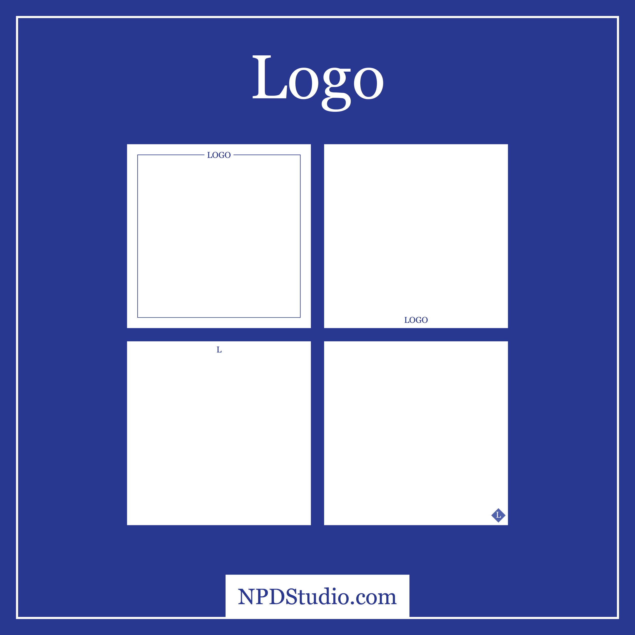
You have a logo and you should use it with your photographs. There are a couple of different ways to go about using it in a supporting role. Initially you will probably consider putting it in the corner of each photo, this can certainly work. If you have an icon that is part of the logo, that might be a better way to integrate your logo without having to put in a lot of text. Sometimes the best option is to write out the brand name or the initials of it in a consistent font that goes with the rest of your branding, maybe the logo is too detailed for a small size or the proportions would not make sense. This logo, or text, can be integrated with other graphic elements that will remain as part of all future branding of photographs. The logo is a great place to put to use your chosen color or colors.
Borders

If you do not want to have your logo floating in a corner, consider using a border that goes around the photo and holds it there. A border could also be a very simple way to add a touch of branding, using a simple border with a common color throughout all your photos can bring a sense of uniformity and make a connection with viewers of the photograph. Borders can be as simple or complex as is appropriate for your brand, you do not want it cutting into the photographs more than necessary. They can actually help you with taking, choosing, and editing photographs that go with the border.
Graphic Elements

This could certainly include logos and borders, but you may have some kind of icon that represents your brand but is not directly your logo. That is only really one of the many possible graphic elements that can really help support building your image branding. Regardless of what you do, remember that you want to leave the photograph clear and readable to the viewer.
Text

The use of text does not need to be constant, but when it is used it should be done so in a consistent manner and treatment. You will want to consider defining a space to hold your text and certainly a font you would like to use. You may want to include your website address or simply your brand’s name on all of your photos, do so in a way that will look uniform.
All Together
Uniformity and consistency may not sound like the goals of a creative endeavor, but they are the foundation upon which a branded photograph can be built. That photograph’s consistency is vital to creating a brand that can be trusted to continuously produce quality content. Try out your idea on some of your past photos to see what may or may not work.