You need to start by not getting into the mindset that no one will see photos of your work and invest time into getting photos taken and then get them out into the world. You can certainly use photographs on their own, but integrating them into simple graphics and digital layouts that can easily be shared is a great way to putting them to use.
Emails
A good place to start is by sending embedded images to clients as reference or inspiration. When you send a bunch of separate files, things tend to get confusing as sometimes lost to varying degrees. By putting together a simple graphic, maybe use a grid of images with your business logo and contact info, you can have it neatly organized in one file that can be seen right away. Together in one graphic, the relationships between the photographs and any other elements can be much more easily understood by a client. You might be showing them what you have done previously, objects or colors that relate to the project’s overall goal, or simply trying to spark their imagination.
Email Newsletter
If you want to keep people updated on a regular basis, directly into the email inbox, it is worth considering building an email newsletter. This is a great place to showcase new and upcoming work and update people and clients in a visual way. Here you want to plan and be consistent, as with any of these ideas, if you hope people will actually look at your email. Creating graphics that use photos in grids, or more loosely arranged layouts, can give a lot of character to your newsletter and make it a fun experience to keep updated on what you are doing as a business.
Social Media Posts
Use Multiple Photos
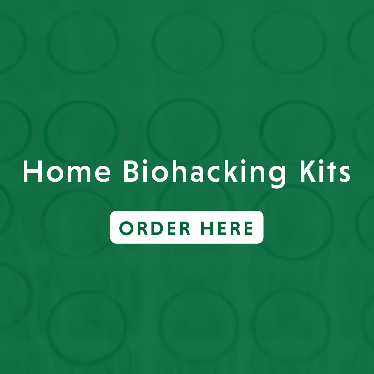
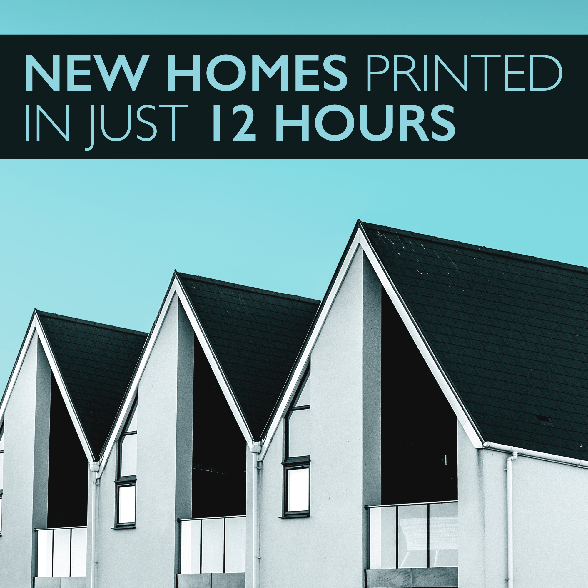
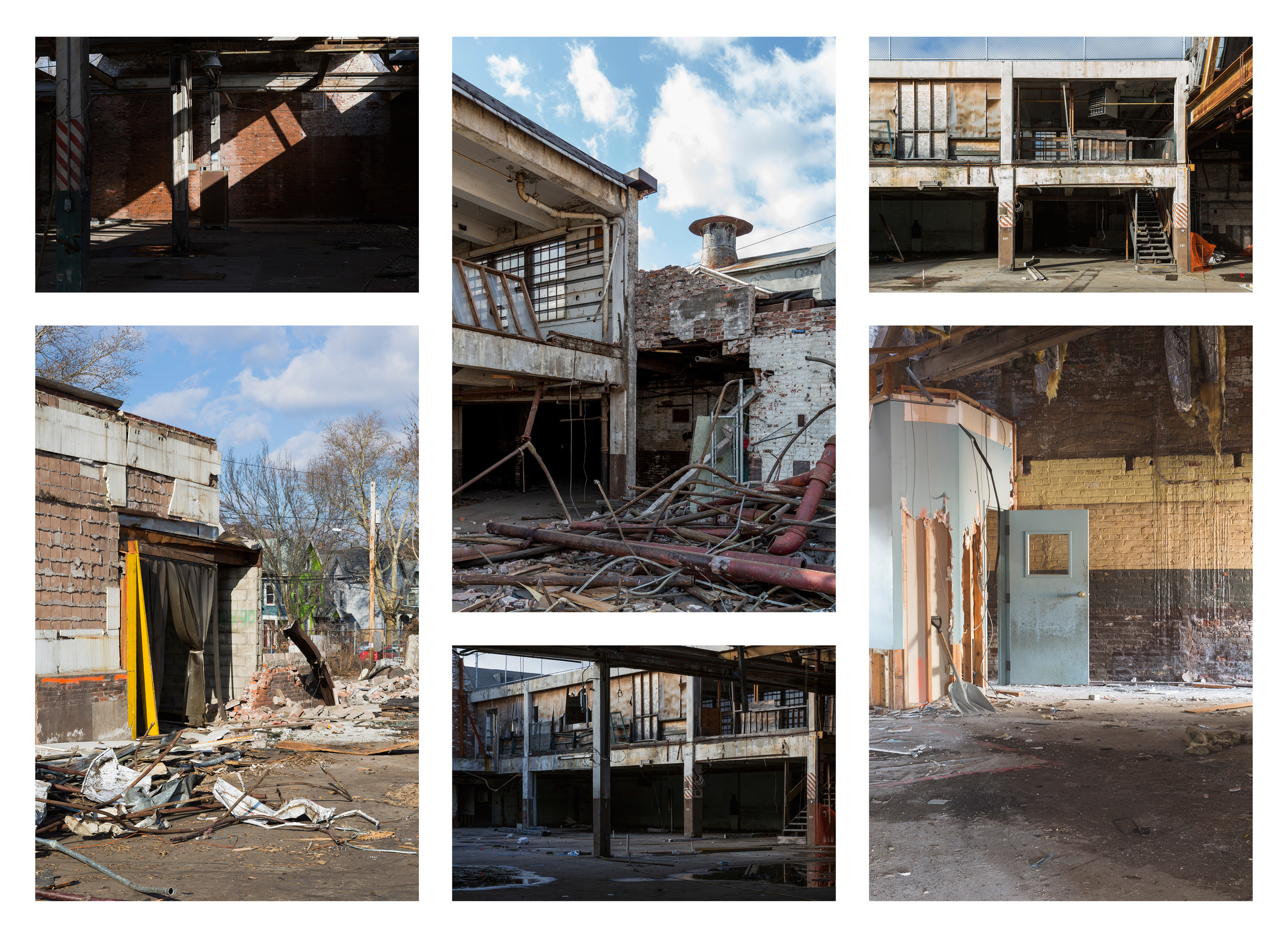
From here, a great way to use photos in graphics is through social media posts. You could do a simple grid of four or more photos. They could all be images of one project, a sequence or process of some kind that you go through, or a couple of photographs that highlight the key element of your business.
Add Supporting Text
These could be left as is, maybe put your logo in one of the sections or at the bottom of the layout, but you could also consider putting text to good use here. The text can be as simple as a single adjective, or adverb, that describes the overall or specific photo in the grid. You want to make sure the text is legible at a likely small size, otherwise it is of no value to the graphic, consider using a solid shape behind the word, one that can be used in each section and graphic.
Use Your Logo
If you have a logo, or even a business name in a particular font, it is definitely worth using with your photos on social media. You don’t want to overcrowd the image with branding though, but this is really about building brand recognition. Do not think watermark, keep it off the main part of the photo, keep it subtle but legible. If you are working with a social media platform that uses reposting in one form or another, this is a great way to have your business and content spread together.
Use Graphic Overlays
If you do not want to use your logo you can still emphasize consistency throughout your use of photos in social media posts. Consider using a graphic overlay that can be used on all posts. It could be a particular graphic element such as a shape or border in a particular color, or a logo. Keeping this out of the way from distracting from the photo would be ideal, consider only using the outer edges of the image for this purpose.
Integrate Graphic Elements, Text, Illustrations, and Photos
You can also create free form layouts with multiple images arranged in less rigid formats. One way is to use photos in a collaged look with images cut out and overlapping one another. Another approach would be to integrate graphic elements, text, or illustrations that interact with the photographs, as an extension of the overall layout and concept. This is a great opportunity to get creative, but be sure to still being in elements that help draw the layout back to your business and branding.
Once you get started on putting those photos to use, other ideas will hopefully come to you as well. Try writing down the ideas as they come and try out a few new ones on a regular basis.